The Film with Many Names
I saw 3:10 to Yuma over a month ago (nothing like striking while the iron is hot) and, though I haven't seen the original, I thought it was fantastic. Mangold doesn't necessarily dazzle with his direction, but he shows enough restraint to let the characters really shine. Ben Foster surprised me as a great villain, Beltrami does his best Morricone impression, and Bale/Crowe carry the movie with great performances.
But this post isn't really about the movie (well, it kinda is), it's about its identity.
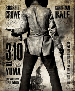
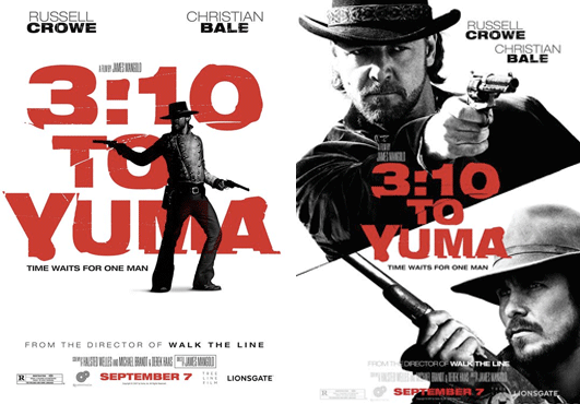
Leading up to the release, I wasn't particularly excited for this movie. I figured it would be another simple retread, financed to capitalize on a genre that hasn't received a lot of attention as of late. Recruit some stars and release it during one of the slow parts of the movie season, and the studios don't stand to lose much. I was wrong. They did a great job on the movie–except for keeping anything visually consistent.
This really bothers me because, for a film where it's obvious that people involved were giving great effort, it's equally apparent that nobody gave much care to crafting a cohesive identity for such a strong narrative.
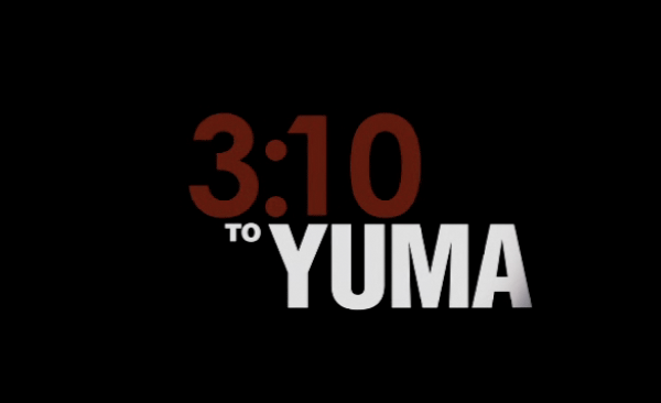
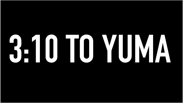
Here's my quick mock up without any degradation:
3:10 to Yuma did moderately well at the box office and received a good amount of praise from critics, but I really think it deserved a better shake for its identity. Frankly, it's just disappointing to see a good movie go without good design. Most great movies have great titles or opening sequences. They indicate to the viewer that this is a special experience and are usually the first step in immersing the audience in that unique world.
For added good measure, I'll leave you with one of the posters for the original 3:10 to Yuma: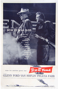
(Note: I stole all these images off the web and uploaded them here. If you'd like any of them taken down, just ask.)